Have you ever wanted your users to click a link but didn’t know how to get them to act? When some designers run into this problem, they’re tempted to use the words “Click here” on their links.
Before giving in to the temptation, you should know how using these words on a link can affect how users experience your interface. Not to mention that having proper link titles is a major accessibility requirement since the term ‘click’ is irrelevant to many assistive technologies and isn’t descriptive enough for screen readers.
“Click” Puts Too Much Focus On Mouse Mechanics
In my opinion, using the word “click” on your links takes the user’s attention away from the interface and on to their mouse. Users know what a link is and how to use a mouse. Calling attention to the mechanics is unnecessary and diminishes their experience. Instead of focusing them on the interface and its content, “Click here” diverts their attention to themselves and their mouse. Not to mention, you might also make them feel dumb by suggesting that they don’t know what a link is or how to use a mouse.
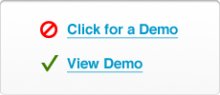
“View” relates to the user’s task, while “Click” puts focus on mouse mechanics.
Instead of using the word “click, ” you might look for a different verb that relates to the user’s task. There’s always a better and more relevant verb to be used. “Click” makes users think of their mouse; but a task-related verb would make them think of the task itself and would keep them engaged with the content and focused on using the interface, not their mouse.
“Here” Conceals What Users Are Clicking
Some links use the word “here” instead of “click.” The problem with using “here” in a link is that it conceals what the user is clicking. The text around the link might explain what they’re clicking, but when the user reads the link itself they won’t have a clue. This means that the user has to read the text all around the link to understand the context of the link, thus impeding them from taking the quick and short route of clicking the link directly. If there’s a lot of text, this could slow the user down a lot.
 When your link communicates more than “here, ” users can skip the verbose text and go right to the link.
Not only that, but if multiple links say “here, ” “here” and “here, ” the user has to go through the trouble of differentiating between each link, opening each one to see how it’s different. And if the user wants to return to a particular source, they have to remember which “here” it belongs to. This forces them to have to use recall over simple recognition. Instead, it’s better to label the links with something that describes what the user is clicking to, so that distinguishing between the links becomes easier.
Links that are labeled are a lot easier to distinguish.
Using the word “here” to make a link noticeable is unnecessary because that’s what the distinct styling of a link is supposed to do. If you feel like you have to use the word “here” to get users to see the link, then there’s a problem with how your links are styled. Are your links the same color as the rest of the text? If so, users could have a hard time identifying them. Are links visually distinguishable through color and shape? A change in color can give links higher contrast — and a change in shape, such as underlining or bolding, even more so.
Phrasing Links The Right Way
What your links say can say a lot about your website. Using the right words is important. Below are a few techniques to help you make the most of links.
Link to Nouns
Instead of saying “click here, ” it’s probably better to make concrete and proper nouns in a sentence the link anchors. Concrete nouns are best in my opinion because they are more immediate and vidid and give users a better idea of what they will get when they click through. Proper nouns are good because they represent unique entities that stand out in and of themselves.
Usually I prefer to avoid using only verbs as anchors because they’re vague and often don’t give a clear picture of what to expect. Rather, nouns enable the user to easily scan the link anchor and quickly grasp what they’re clicking to without having to read the entire sentence or paragraph. An alternative option would be to use verbs and nouns but with this approach some links might become way too lengthy.
Using nouns as anchors gives a better picture of what the user is clicking to.
End on a Link
You might want to try to structure your sentences so that the link anchors fall at the end. This will make links easier to spot because users will see each one as soon as they finish reading the sentence. Thus, they will be able to take action immediately, rather than having to go back and hunt for the link in the middle of the sentence.
Linking at the ends of sentences helps users to act more quickly.
Link to Specifics
It’s also a good idea to choose the text of your link anchors as specific as possible. For example, if you’re linking to an article or book, it might be a good idea not to use the word “article” or “book” for the anchor. Instead, we could use the relevant title. This will give the user more detailed information about what they’re clicking to and what to expect. Also, we could include more details about the link in brackets, e.g. (PDF, 5.5 Mb).
Make Links Click with Users Without Saying “Click Here”
The next time you consider using the words “click” or “here” for links, remember the effect it will have on the experience. The challenge is to make your links communicate “click here” without actually saying “click here, ” and there are many ways to do this. It will take some thought and effort on your part, but in the end, users will benefit with a better experience. So, either take the easy way out and just say “click here” or spend some time finding phrasing that really clicks with users. The choice is yours.
So how do you choose the words for your links? Do you link verbs, nouns or both? Do you use “click here”? Share your opinion in the comments! We are looking forward to your feedback!